A Look at Winter Olympic Design Systems Since the First Games in Chamonix in 1924
From Chamonix 1924—to PyeongChang 2018. From 16 participating countries—to over 80 today. The whole world is watching. Designing for the Olympics is no small task. We take a closer look at each of the Winter Games logos, and pick our faves. What're yours?
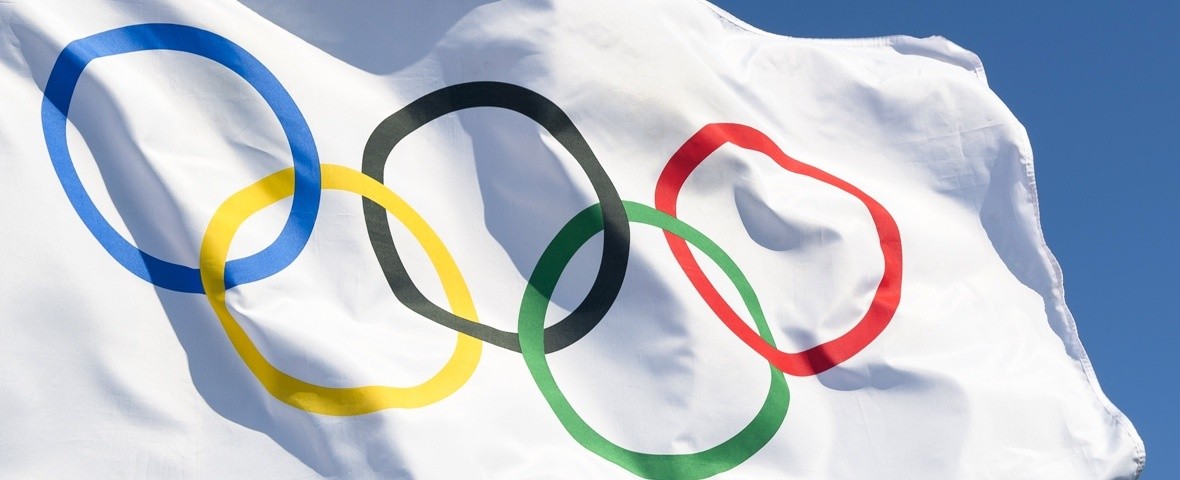
Photo credit: lazyllama / Shutterstock.com
It is the beginning of February and I can’t help but be excited about the upcoming Winter Olympics opening this Friday, February 9th. Being a sports enthusiast and a snow lover (I’m 100% Polish - it snows A LOT there) has me completely infatuated with the Winter games.
As a designer, I am fascinated by the visual language developed for each Olympic Games. There are many requirements that must be factored into the design process. Such as, the design has to represent the Winter Olympic Games spirit, and the location in which the Games are held. It has to be consistent and coheasive across all the necessary pieces. It also has to stand the test of time, as the design is often revealed years before the actual event takes place, when a particular city bids to become the next host of the Games. And when the Games end, it becomes part of our history. So…no pressure there!
Over the years while some logos have been a clear success, some not even close, others ended up in controversy. Either way, the designs have been widely discussed by designers, as well as other—less artsy folks out there. They have evoked emotions—and in some cases—very strong opinions.
With the 2018 games upon us I thought that it would be fun to go back in time and put together a compilation of all the Winter Games designs, starting with 1924, Chamonix, France - the home to the first modern Winter Olympic Games. I also included here a few stats that I found interesting—and I hope that you do too. So let’s get to it!
I. CHAMONIX 1924
- COUNTRY: France |
- Athletes: 258 |
- Countries: 16 |
- Events: 16
The Design
For the first games the only formal piece of design that we found was a lithograph poster by Auguste Matisse of which 5000 copies were created in Paris.
The design consists of an eagle that soars above a bobsled track, against a winter Alpine landscape. In its talons, it holds a palm branch and a victory crown, tied together with a ribbon in the colors of the French flag. The poster is at an interesting angle, where the eagle, rather than the mountains—or the athletes, is in the foreground.

II. ST. MORITZ 1928
- COUNTRY: Switzerland |
- Athletes: 464 |
- Countries: 25 |
- Events: 14
The Design
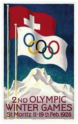
The 2nd Winter Olympic Games poster was designed by Hugo Laubi with 12,000 copies printed. It illustrates the Swiss and Olympic flags set against a blue sky. The lettering is set against snowy peaks of the Swiss Alps. Again, there is no actual logo this time, just this official poster that was representing the Games.
III. LAKE PLACID 1932
- COUNTRY: USA |
- Athletes: 252 |
- Countries: 17 |
- Events: 14
The Design
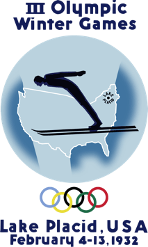
The designer of this poster/logo is Witold Gordon. There were more than 16,000 copies printed in three languages: English, French and German. Most of the posters were distributed in Europe.
While the logo is readable, It is not the most sophisticated solution for either the mark, or the typography.
IV. GARMISCH-PARTENKIRCHEN 1936
- COUNTRY: Germany |
- Athletes: 646 |
- Countries: 28 |
- Events: 17
The Design
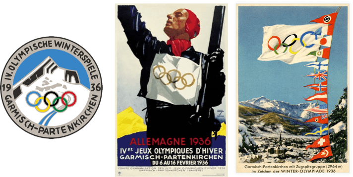
In the design of the logo you can clearly make out the mountain, the Olympic circles, and the ski track going down the mountain. It is an simple choice, but works fine from the readability point of view.
The posters of the Games were designed by Ludwig Hohlwein. Many of them are shocking with the inclusion are Swastikas and Nazi banners depicted in some of the designs. The following two Winter Olympic Games were cancelled due to WWII.
V. ST. MORITZ 1948
- COUNTRY: SWITZERLAND |
- Athletes: 669 |
- Countries: 28 |
- Events: 22
The Design
1948 Games poster is a lithograph designed by two collaborators, graphic artist Fritz Hellinger, and a photographer named Keerl. There were about 15,000 copies printed in different languages.
The main focal point of the design is the sun, which was the logo of the host resort of St. Moritz. The Olympic circles, and the lettering are set on a white snowy background of the Alps. The sky is filled by a light-to-dark gradient, sun rays, and whimsical snowflakes. A couple goes for a casual cross country ski. There is calmness to the scene that while very appropriate for a St. Moritz postcard, does not convey the competitive nature of the Olympics. Otherwise, a beautiful design.

VI. OSLO 1952
- COUNTRY: NORWAY |
- Athletes: 694 |
- Countries: 30 |
- Events: 22
The Design
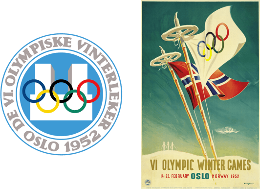
In the center of the logo there is some sort of a structure, maybe a building? Without much detail it is hard to make out what that could actually be. Not the most impactful or memorable logo solution.
Next to the logo is the winning poster of a competition organized by the OCOG, designed by an artist Knut Yran. It shows two upside down ski poles with the Olympic and Norwegian flags against a blue sky. I do like the playful choice of the ski poles, even though I am a snowboarder myself!
VII. CORTINA D’AMPEZZO 1956
- COUNTRY: ITALY |
- Athletes: 821 |
- Countries: 32 |
- Events: 24
The Design
The logo, created by Franco Rondinelli, was chosen following another competition organized by the OCOG.
It shows the Olympic logo of the 5 circles with a star on top, above the Cortina village. The lockup is placed inside a graphic snowflake. In a poster application it is used against a blue background. About 30,000 copies of the poster were printed.
This is a definite improvement over the previous logos. Let’s see what’s next!

VIII. SQUAW VALLEY 1960
- COUNTRY: USA |
- Athletes: 665 |
- Countries: 30 |
- Events: 27
The Design
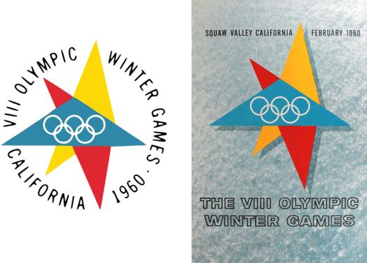
The logo and the poster were designed by the Knollin Advertising Agency in San Francisco. The design itself is formed by three overlapping triangles, with the Olympic circles in the center. I do like the star shape that the triangles form. There is a movement, and agility to it. A far better choice for a major sporting event than the earlier static and symmetric designs.
For the poster, the logo and the typography are placed on fresh, sparking snow on a sunny day. The in-the moment effect makes me feel like I want to be right there, right now. Over 57,000 copies of the poster were produced and distributed throughout the USA and abroad.
IX. INNSBRUCK 1964
- COUNTRY: AUSTRIA |
- Athletes: 1091 |
- Countries: 36 |
- Events: 34
The Design
Another successful logo. The shield-like shape is simple, and it speaks to the history of the city of Innsbruck. Everything is readable. The type could maybe use some improvement, as it doesn’t curve very naturally around the shape.
Next to the logo is the official poster of the Games. While the type doesn’t stand the test of time, I do like the texture of the cropped snowflake on the black background.

X. GRENOBLE 1968
- COUNTRY: FRANCE |
- Athletes: 1158 |
- Countries: 37 |
- Events: 35
The Design
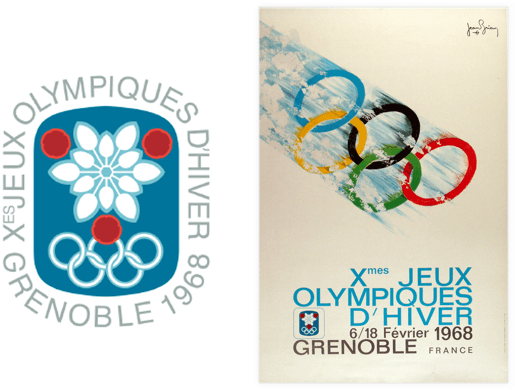
I don’t love this design. The typography wraps uncomfortably around the shape. The design is lacking any movement. In the middle of the graphic there is a decorative snowflake, or flower-like shape, that would be more fitting for a winter Christmas market, rather than the biggest winter sports event in four years.
The poster is much more successful. The typography works nicely with the rushing down the slope, covered in snow, Olympic circles. It is an offset print, printed in 170,000 copies.
XI. SAPPORO 1972
- COUNTRY: Japan |
- Athletes: 1006 |
- Countries: 35 |
- Events: 35
The Design
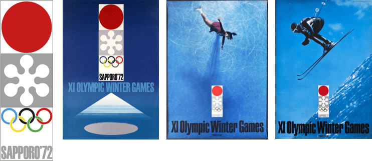
The vertical logo lockup, designed by Takashi Kono, combines three elements; the rising sun, a very graphic snowflake, and Olympic circles with the host city’s name.
This is a simple, successful design. And I like how it is applied to the set of the official posters, designed by Yusaku Kamekura. Below are a few of the series.
XII. INNSBRUCK 1976
- COUNTRY: Austria |
- Athletes: 1123 |
- Countries: 37 |
- Events: 37
The Design
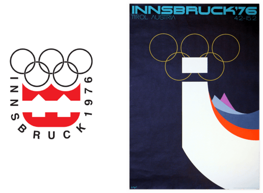
This is a refreshment of the logo from Innsbruck’s Winter Games from 12 years prior. The typography still curves somewhat uncomfortably around the shield-like shape.
The poster was designed by Arthur Zelger, and produced in 11,000 copies.
The white shape in the foreground is supposed to represent a blade of an ice skate, or a luge, as well as the letter “i” for Innsbruck. The shapes in the background are representing the mountains of Tyrol. The colors used are attractive, but the shapes themselves seem very generic, and not particular to the region.
XIII. LAKE PLACID 1980
- COUNTRY: USA |
- Athletes: 1072 |
- Countries: 37 |
- Events: 38
The Design
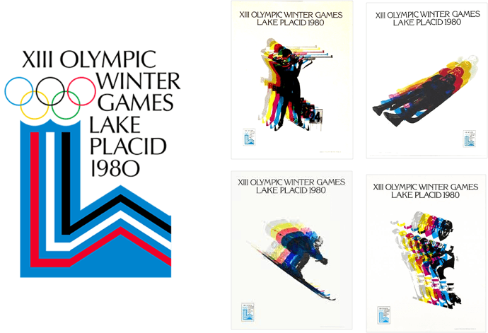
This logo and poster are designed by Robert W. Whitney. The triangle shape represents a mountain, and the column on the left, not as clearly, a double Olympic cauldron (Winter Games 1932 and 1980).
While the graphic has a certain attractive boldness to it, it is also a strange shape that looks like it is cut off on the right side. The typography is nice—large and readable.
Next to the logo is a series of posters, designed by Robert F. Madden, representing different sports. The series does a great job capturing movement, and dynamic nature of the sports.
XIV. SARAJEVO 1984
- COUNTRY: BOSNIA AND HERZEGOVINA |
- Athletes: 1272 |
- Countries: 49 |
- Events: 39
The Design
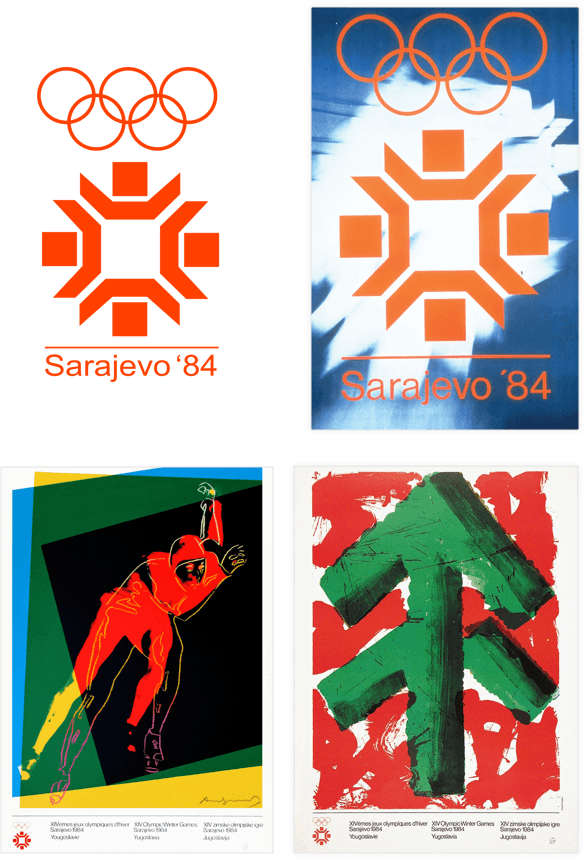
In the center of this design is a graphic snowflake, with the Olympic circles above, and a very simple typography below. It is hard to tell what was the inspiration for the shape of a snowflake, maybe local architechture?
The poster is based on the same logo, with an abstract photograph of what looks like a falling snowflake in the background.
Below the official designs I included two posters that I particularly liked. The one on the left is by Andy Warhol to the right of it is a poster by Howard Hodgin.
XV. CALGARY 1988
- COUNTRY: Canada |
- Athletes: 1423 |
- Countries: 57 |
- Events: 46
The Design
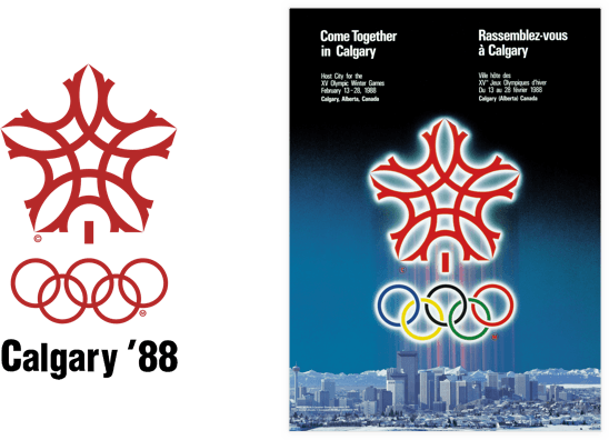
The logo seems to be fittingly made of the letter “C”—that stands for both Calgary and Canada. Unfortunately, over all effect has somewhat oriental, or Middle-eastern feel to it, a choice that doesn’t represent Canada very well.
The poster has a really dreadful white glow around the design, that makes it stand out from the dark background. The logo hangs in an ominous way above the city—looking as though it was about to begin some sort of extraterrestrial invasion.
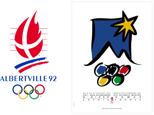
XVI. ALBERTVILLE 1992
- COUNTRY: FRANCE |
- Athletes: 1801 |
- Countries: 64 |
- Events: 57
The Design
XVII. LILLEHAMMER 1994
- COUNTRY: NORWAY |
- Athletes: 1737 |
- Countries: 67 |
- Events: 61
The Design
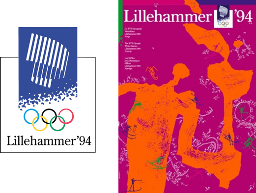
The abstract mark above the simple typography and Olympic circles is, well… hard to figure out what it is. A building maybe?
I do like the official poster on the other hand. It speaks to Norway’s heritage of cave engravings from thousands of years ago. The main image is of an athlete carrying the Olympic torch. There are pictograms included in the design representing many of winter sports.
XVIII. NAGANO 1998
- COUNTRY: JAPAN |
- Athletes: 2176 |
- Countries: 72 |
- Events: 68
The Design
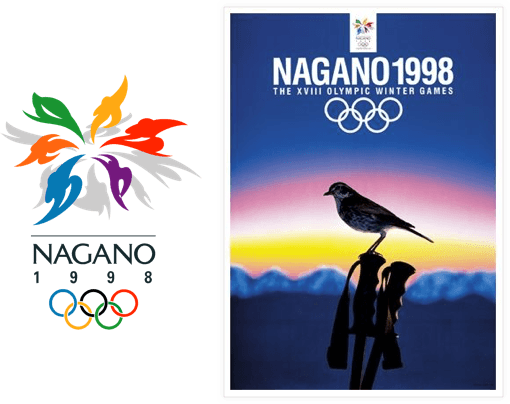
Nagano ’98 logo has both a nice mark and good typography. The mark looks like a flower composed by moving people - a very fitting choice. The typography supports the mark well, and the over all effect is balanced.
The poster, by a renowned Japanese artist Aoba Masuteru, represents harmony of the Games with nature.
XIX. SALT LAKE CITY 2002
- COUNTRY: USA |
- Athletes: 2,400 |
- Countries: 78 |
- Events: 78
The Design
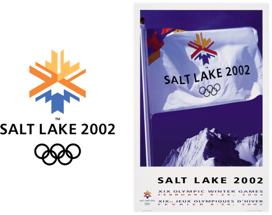
Another strong mark, with good supportive typography. The snowflake represents the local scenery; the sun over the mountain, with the blue lake on the bottom.
XX. TORINO 2006
- COUNTRY: Italy |
- Athletes: 2508 |
- Countries: 80 |
- Events: 84
The Design
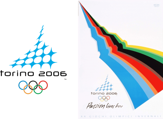
This is a strange mark, and for an average person (myself included) it is really hard to figure out what it represents. To me it looks like the plastic wrapper that holds soda cans together.
If you took away the Olympic circles, the mark could be used for anything really. The stylized typography didn’t stand the test of time either—it looks outdated.
The poster is also very abstract. Other then the use of the Olympic colors in the diagonal stripes, it could be really anything. A ski jump? A bumpy ski slope? A thunder? Topography map? What is it?
XXI. VANCOUVER 2010
- COUNTRY: Canada |
- Athletes: 2566 |
- Countries: 82 |
- Events: 86
The Design
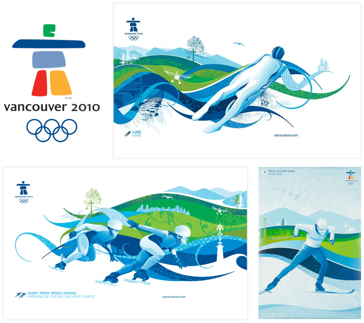
Even though it is a bit hard to explain how this mark relates to Canada at a first glimpse, I do like the balancing arrangement of the colorful shapes that make up a person. The result is really friendly and fun. The typography goes nicely with the design. The mark also looks good on the series of posters for the Games.
While the posters now are starting to look a bit outdated, with all the busy vector swooshes in there, I do like the use of the white space. I also like the straightforward and litteral illutrations of the sports, which take the main stage in all the posters.
XXII. SOCHI 2014
- COUNTRY: Russia |
- Athletes: 2566 |
- Countries: 88 |
- Events: 86
The Design
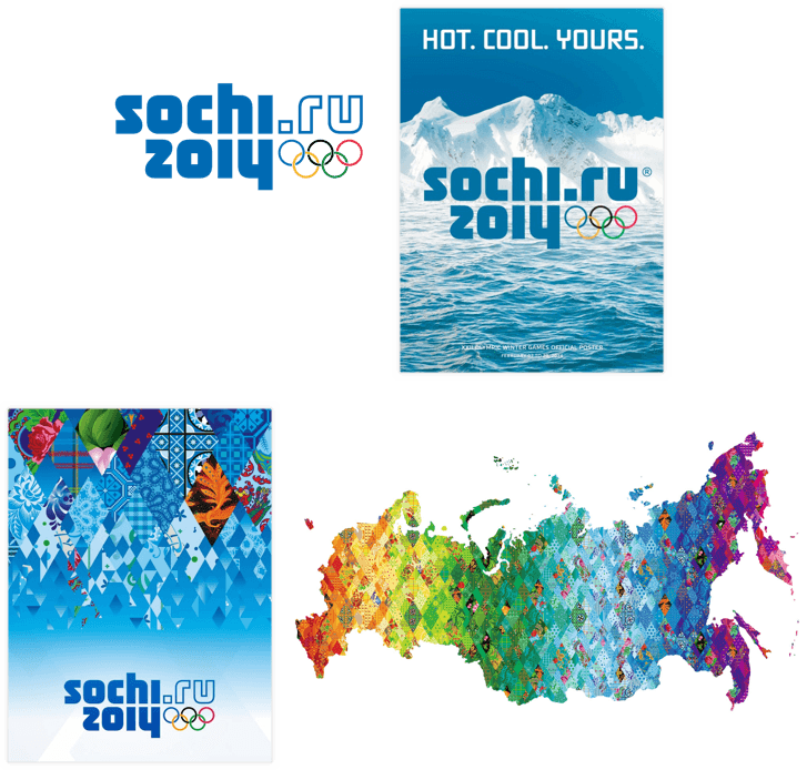
This typographic solution, when presented on it’s own, doesn’t provide too much Olympic excitment. It is clunky and unattractive.
The vibrat system of patchwork, quilt-like paterns developed for the Sochi Winter Games, on the other hand, does a great job reflecting Russian culture, with it’s many traditional arts and crafts. The design succeeded at marrying the ritch traditions with the modern look of the Games. The pattern applications are great also. I still wish the logo reflected some of these concepts and blended in better with the over all look and style.
XXIII. PyeongChang 2018
- COUNTRY: Korea
The Design
As per the official website of the 2018 Winter Games (pyeongchang2018.com/en/design): “The emblem symbolizes a world open to everyone. It combines the image of ice and snow, winter sports stars (athletes), and people from all over the world, coming together in PyeongChang where heaven meets earth.”
The shapes in the logo, designed by Ha Jong-joo, are based on the Korean alphabet, and over all are to communicate humanism. The larger shape symbolizes the harmony of Heaven, Earth and Man, and the star-like shape represents snow, ice and winter sports stars (athletes).
Unfortunately, if I didn’t go to the website and read all of the above, I would not understand the meaning of these shapes, just by looking at the logo. To me they look like a greek column, and the sun.
In any case, I am impatiently looking forward to seeing the rest of the designs, posters and other applications at the venues in PyeongChang. And, best of luck to all the athletes, go kick @#&!
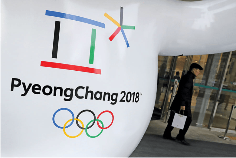
Photo credit: Lee Jin-Man/AP
References
- • https://www.olympic.org
- • https://www.wikipedia.org
- • https://stillmed.olympic.org/media/Document%20Library/OlympicOrg/Factsheets-Reference-Documents/Games/Posters/Reference-document-OWG-Posters-from-Chamonix-1924-to-Sochi-2014.pdf