Looking at Accessibility and Better Usability For All

Making a website accessible is an important part of the web design and development process. Here are a few easy ways to make your site more accessible to not only those with disabilities but everyone who visits your site:
Colors
Using only color to distinguish something on your page can make it difficult for those with color deficiencies to tell that you are trying to differentiate something. On the other hand, using different colors can be helpful for people with learning disabilities. There should be something else used in combination with a color change to show that you are trying to alert the user that that object is different. For example instead of just changing the color of link to show that it is clickable, an underline could also be added underneath the link text or an arrow could be added next to it.
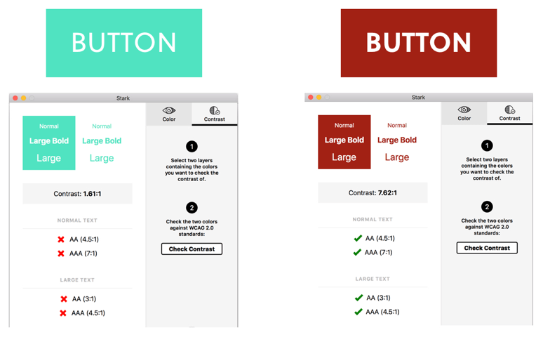
Colors also play a big role in the readability of text on your website. There should be enough color contrast between foreground and background colors to make it easy for users to navigate and use your website. If the color of the text and the background color are too similar it can make it very difficult for people to read. There are many handy tools that can help check the contrast of the colors used on your website. The one I use the most is the Color Contrast Check from WebAIM (https://webaim.org/resources/contrastchecker/). You can enter the foreground and background colors and it will give you the contrast ratio of those two colors as well as tell you if that ratio fits within the Web Content Accessibility Guidelines (WCAG) 2.0.

Alt Text
For those with visual impairments, providing alt text can help them to know what is happening in an image on the page. All images should have an alt attribute; however, there are instances in which an image may have an empty alt tag. In general an image’ alt text should explain what is happening in the image; however, if the image is purely for decorative purposes, the alt tag should be left empty.

Forms
Providing labels for each form field is essential, especially for those using screen readers. Oftentimes people will use the placeholder text of an input to give instructions as to what is supposed to go in that input. Many screen readers cannot read this placeholder text, so that user may not know what they are supposed to input. Having a clear label for every form field makes it easier for users to understand what they are supposed to put in the input. Adding an example in the label can also be helpful for users.

Logical header tags
The order of elements on a page should make logical sense. For example, a header should mark the start of a section. Header tags should not used solely for styling text. Some screen readers scan a page for header tags so if your page does not have semantic header tags, this can cause the screen reader to jump around in a way that is confusing for users.

Link names
Give all links a descriptive title. Many screen readers can jump from link to link so if all your links are simply “Click here” that doesn’t tell the user why they are clicking there. Having the screen reader read out “Click here” over and over is not a great experience for the user. Instead of “Click here” your link could read “Learn more about [subject of linked page]”. That will explain to the user what they will be reading about on the next page if they were to click that link.
These are a few of the many ways to make your site more accessible to everyone. There are numerous resources available that go more in depth on the other aspects of web accessibility so check out the resources section to learn more!

Resources:
Color Contrast Checker: https://webaim.org/resources/contrastchecker/
A11y Project: https://a11yproject.com/
Free Web Accessibility Course by Google: https://www.udacity.com/course/web-accessibility—ud891
People in the web accessibility community to follow: https://github.com/joe-watkins/top-people-to-follow-in-web-accessibility
