Design Trends from 2017

A new year is here and it’s time to be sure our site designs look fresh and new. Old visual trends we thought have got put to rest were modernized this year and came back better than ever. Check out these trends that inspire us and can be used in your upcoming project.
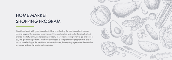
Hand Drawn Illustrations
The use of custom hand drawn graphics help better tell a story for the aligned content. We’re certain this trend will be everlasting as they are so unique and special to a brand. Hand drawn graphics can be seen replacing photos, icons, and fonts! Seeing these types of graphics show that a company is willing to take the time and make something great that works for them.
Subtle Animations
When designs feel a little left to be desired but the overall look of the website accomplishes every goal you need, it may be time to introduce some animations. Animations don’t have to be crazy and complex to add a nice touch onto existing content. Sometimes just a smooth hover animations or a fade-in, fade-out can make a bland site come to life.

Semi-Flat Design
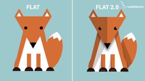
“Flat” Design refers to a style of interface design emphasizing minimum use of stylistic elements that give the illusion of three dimensions (such as the use of drop shadows, gradients or textures) and is focused on a minimalist use of simple elements, typography and flat colors.
So What’s “Semi-Flat”? We have been seeing little tweaks making traditionally flat designs have a little more depth but not fully portray the concept that it is “3D”. Originally the flat style was popular to help have a clearer User Interface but designers are finding the introduction of some depth is giving users a better understanding of visual hierarchy.
Image source: codetiburon.com
Drop Shadows
Drop shadows are finally back! For what feels like almost a decade drop shadows had no use in the flat design world. With the more common use of this Semi-flat design trend drop shadows are back to give typically flat designs a bit more depth. Not entirely creating the illusion of a 3d environment. However, we are not seeing the typical harsh drop shadows we were used to seeing. Instead these shadows are lighter, softer, and sometimes barely even noticeable. This trend has a way of keeping things simple and clear but giving strength to visual elements that needed better calling out.

Gradients
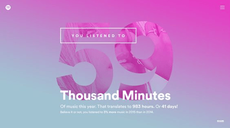
Along with drop-shadows, Gradients feels like we are going into a library to dust off an old book full of forgotten design trends. I remember my college professor who was a flat design praiser, would actually be disturbed at the sight of a gradient if it was in anything we had to show her. Well they are back and better than ever! Designers are finding new ways to combine gradients and duotones for a truly satisfying result. My favorite example of gradients with a vengeance is done by Spotify. Gradients are giving the traditional flat designs a more sophisticated and humanistic feel.
Popping Colors
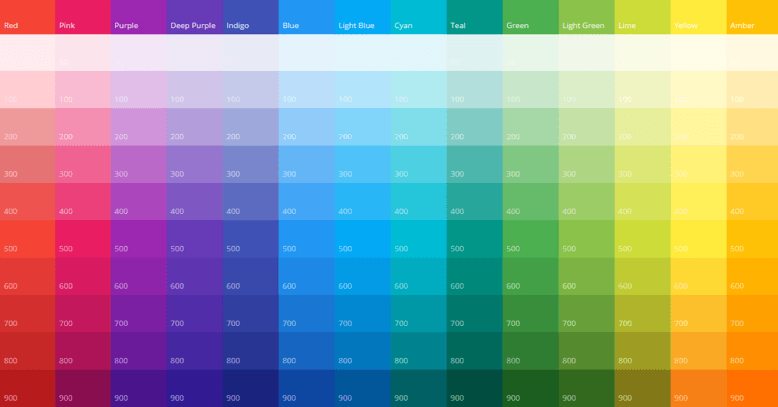
The trend of muted colors everywhere is finally getting outshined by designs with loud colors that break the spectrum. The use of tasteful bright colors can stand out amongst the crowd, even if its just an accent. Keep in mind that just because bright colors are something to be attracted to by no means forget about contrast. We don’t want to scare someone off like those old bright green and yellow pop ups you’d see surfing the web on windows 98.. but instead get them intrigued and feel some kind of emotional response to the aligned content.
Hidden/Collapsed Menus
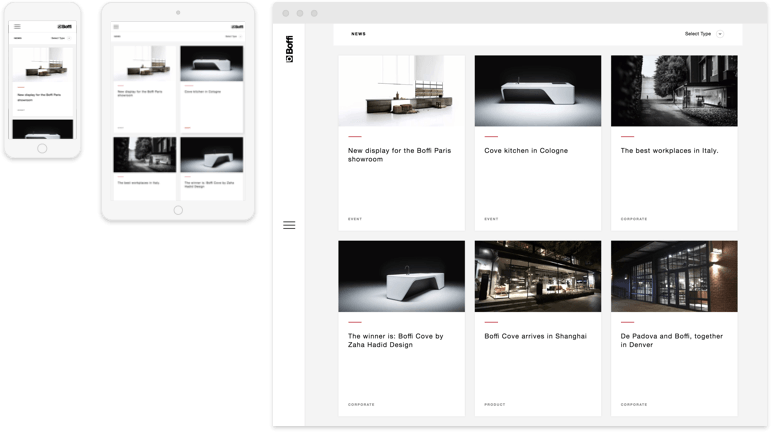
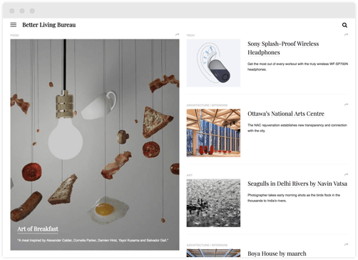
For the last few years users have been slowly introduced to the “hamburger” ( pic ) style menu when viewing websites on smaller screens. With the normality of seeing a collapsed style menu its starting to be more popular for desktop sizes too to have some kind of hidden menu. This opens up the introduction screen for designers and marketers to take advantage of the extra space. In some cases a flashy UI that uses this functionality can better help sell the aligned content. Another reason for having a collapsed style menu on all screen sizes is so a user can have the same experience when they visit a website, no matter what device they happen to be on.
Open Composition
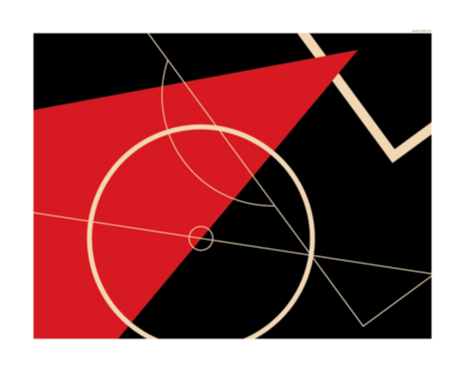
Open composition is when elements of a design give the illusion that they continue beyond the frame. Instead of creating a canvas and trying to shove all your assets inside, let them naturally flow without boundaries. These type of graphics work well with parallax scrolling that suggest movements of objects and makes transitions between screen sizes seem more natural.
Asymmetric Layouts
Asymmetric layouts are when designs break the rules of symmetry. These layouts have a very skewed sense of balance but done correctly can be not only graphically but make content fascinating as well. Paired with open composition you can have a viewers eyes travel in the way you want them. If someone is forced to look at a certain part of the screen and thats where you want them to look, than that is a successful design!
Bold Type
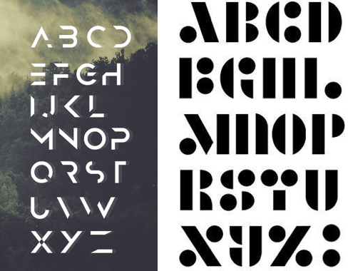
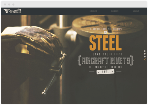
With attention spans dwindling and attention hard to capture, It’s good practice to use hierarchy and large type to give readers a better chance at consuming the information they need about your product/service. Don’t make your viewers have to squint and concentrate to consume vital information, instead make it bold, easy to read, and unavoidable. Large beautiful type can be both informational and a visual element, killing two birds with one stone!
Image Source: Knucklesindustries.com
Cropped Elements
If you’re a fan of minimalism but notice your preference is falling behind to these new risky trends. A way to spice up your graphics is by cropping text and images in unconventional ways. Find how much you can take away from lettering but still maintain its readability. Combined with large bold fonts, this trend can make for a really successful visual element that’ll intrigue an audience.
